
Matplotlib is a powerful and widely-used plotting library in Python which enables us to create a variety of static, interactive and publication-quality plots and visualizations. It’s extensively used for data visualization tasks and offers a wide range of functionalities to create plots like line plots, scatter plots, bar charts, histograms, 3D plots and much more. Matplotlib library provides flexibility and customization options to tailor our plots according to specific needs.
It is a cross-platform library for making 2D plots from data in arrays. Matplotlib is written in Python and makes use of NumPy, the numerical mathematics extension of Python. It provides an object-oriented API that helps in embedding plots in applications using Python GUI toolkits such as PyQt, WxPython or Tkinter. It can be used in Python and IPython shells, Jupyter notebooks and web application servers also.
Matplotlib has a procedural interface named Pylab which is designed to resemble MATLAB — a proprietary programming language developed by MathWorks. Matplotlib along with NumPy can be considered as the open-source equivalent of MATLAB.
Matplotlib was originally written by John D. Hunter in 2003. The current stable version is 2.2.0 released in January 2018.
The most common way to use Matplotlib is through its pyplot module.
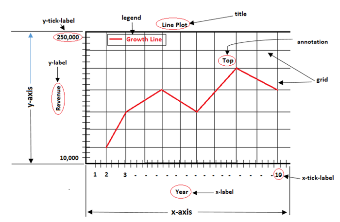
A figure is the entire window or page that displays our plot or collection of plots. It acts as a container that holds all elements of a graphical representation which includes axes, labels, legends and other components.
Example
Output – Figure
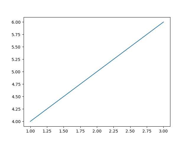
A specific region of the figure in which the data is plotted. Figures can contain multiple axes or subplots.
Example
Output – Axes/Subplot
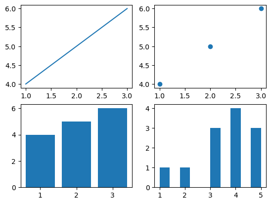
An axis refers to the X-axis or Y-axis in a plot or it can also denote an individual axis within a set of subplots.
Example
Output – Axis
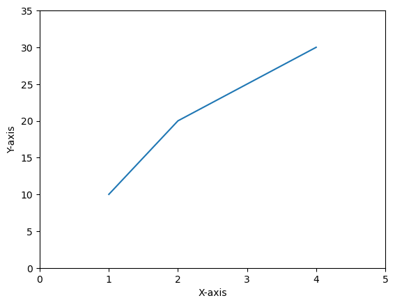
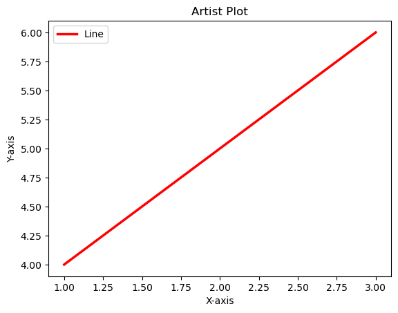
Artists refer to the various components or entities that make up a plot such as figures, axes, lines, text, patches, shapes (rectangles or circles) and more.
Example
Output – Artist
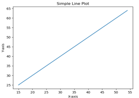
A line plot displays data points connected by straight lines.
Function: plt.plot()
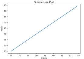
Displays individual data points as markers on a 2D plane.
Function: plt.scatter()
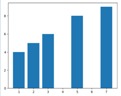
Represents categorical data using rectangular bars.
Function: plt.bar()
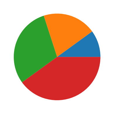
A circular chart that shows percentages of categories.
Function: plt.pie()
We can create multiple plots within a single figure using subplots(). Useful for comparing plots side by side.
Matplotlib allows saving plots in formats such as PNG, PDF, SVG, etc. using plt.savefig('filename.png').