
A colormap, also called a color table or palette, is a range of colors that represents a continuous range of values—effective for conveying information visually.
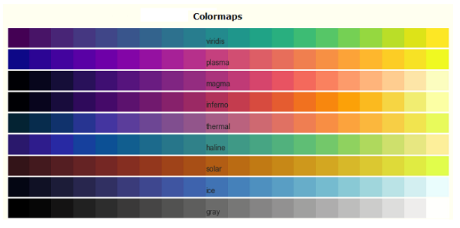
Sequential colormaps increase in lightness—ideal for ordered data.
import matplotlib.pyplot as plt
import numpy as np
import matplotlib as mpl

cmap_list = ['Greys', 'Purples', 'Blues', ...]  # Many more
gradient = np.linspace(0, 1, 256)
gradient = np.vstack((gradient, gradient))
fig, axs = plt.subplots(len(cmap_list)+1, figsize=(7, nrows*0.3))
for ax, name in zip(axs, cmap_list):
    ax.imshow(gradient, aspect='auto', cmap=mpl.colormaps[name])
    ax.text(-0.1, 0.5, name, transform=ax.transAxes)
    ax.set_axis_off()
plt.show()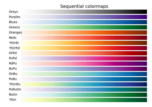
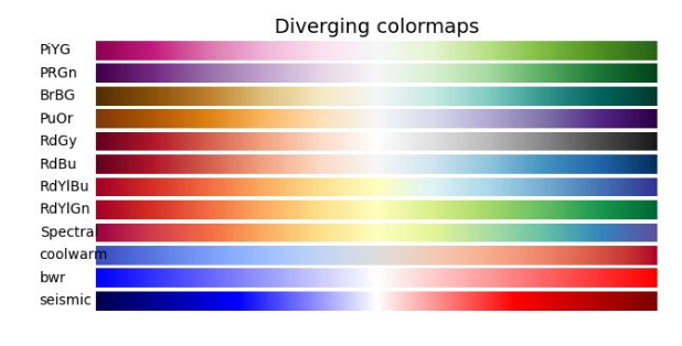
Diverging palettes highlight deviation around a central value.
cmap_list = ['PiYG','PRGn','RdBu','coolwarm','seismic', ...]
# Similar plotting code as above to show diverging gradients
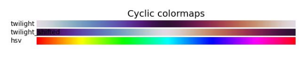
For wrapping data like angles—start and end colors match.
cmap_list = ['twilight','twilight_shifted','hsv']
# Plotting code like above to display cyclic gradients
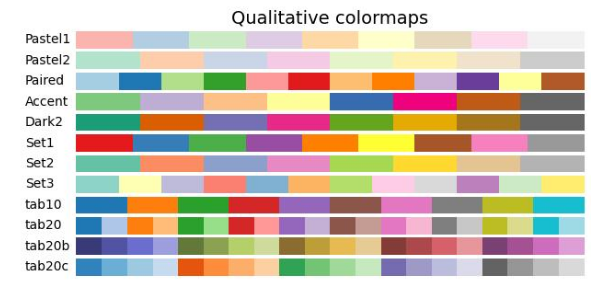
Use distinct colors without order for categorical data.
cmap_list = ['Pastel1','Set1','tab10','Accent','Paired', ...]
# Plot to visualize each qualitative palette
Presented by Vista Academy—master data visualization with Python & Matplotlib!