
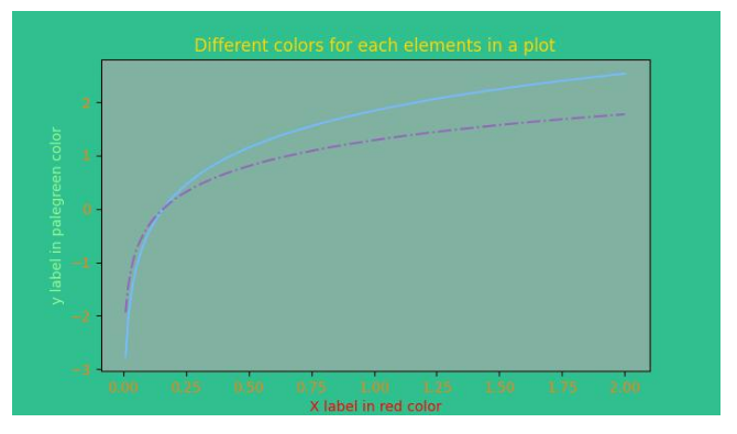
Matplotlib provides several options for managing colors in plots, allowing users to enhance the visual appeal and convey information effectively.
Colors can be set for different elements in a plot, such as lines, markers, and fill areas. The color parameter helps specify these elements. For scatter plots, you can set colors per point.
Matplotlib supports several formats for representing colors:
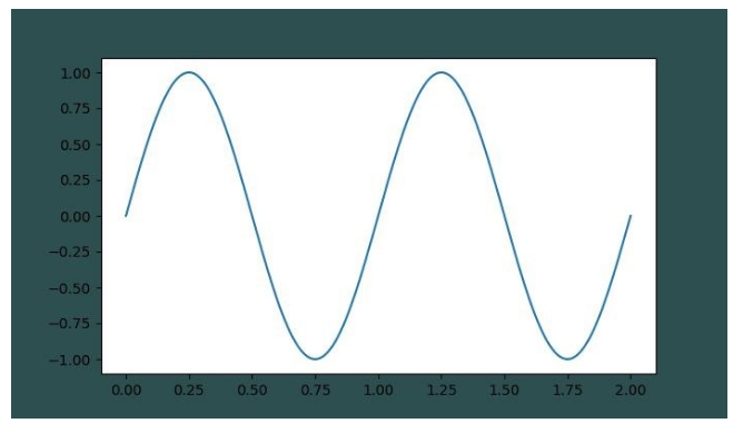
Use a tuple of float values between [0, 1] to represent RGB or RGBA like: (0.1, 0.2, 0.5) or (0.1, 0.2, 0.5, 0.3).
import matplotlib.pyplot as plt
import numpy as np

t = np.linspace(0.0, 2.0, 201)
s = np.sin(2 * np.pi * t)

fig, ax = plt.subplots(figsize=(7,4), facecolor=(.18, .31, .31))
plt.plot(t, s)
plt.show()
Output:
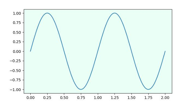
Specify colors using hex strings like '#0F0F0F' or '#abc' (equivalent to '#aabbcc').
fig, ax = plt.subplots(figsize=(7,4))
ax.set_facecolor('#eafff5')
plt.plot(t, s)
plt.show()
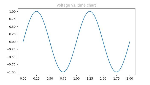
Use a string representing a float [0, 1]. Example: '0' is black, '1' is white.
fig, ax = plt.subplots(figsize=(7,4))
plt.plot(t, s)
ax.set_title('Voltage vs. time chart', color='0.7')
plt.show()
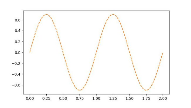
Use 'C1', 'C2', etc., to specify colors from the default color cycle.
ax.plot(t, .7*s, color='C1', linestyle='--')
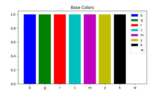
Use one-letter shorthand: 'b' (blue), 'g' (green), 'r' (red), 'k' (black), etc.
import matplotlib.colors as mcolors
base_colors = mcolors.BASE_COLORS
...
ax.bar(i, 1, color=base_colors[color_name], label=color_name)
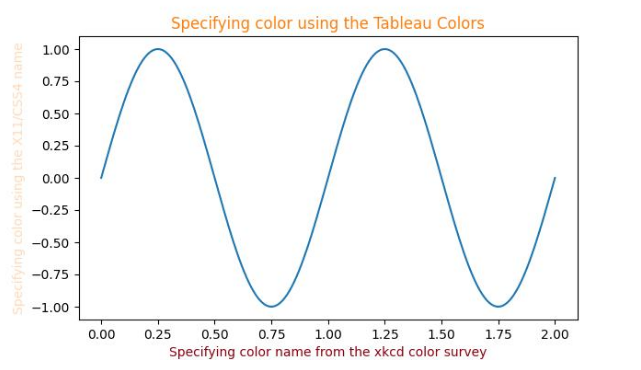
Use readable names like 'peachpuff', 'xkcd:crimson', or 'tab:orange'.
ax.set_ylabel('X11/CSS4', color='peachpuff')
ax.set_xlabel('XKCD', color='xkcd:crimson')
ax.set_title('Tableau', color='tab:orange')
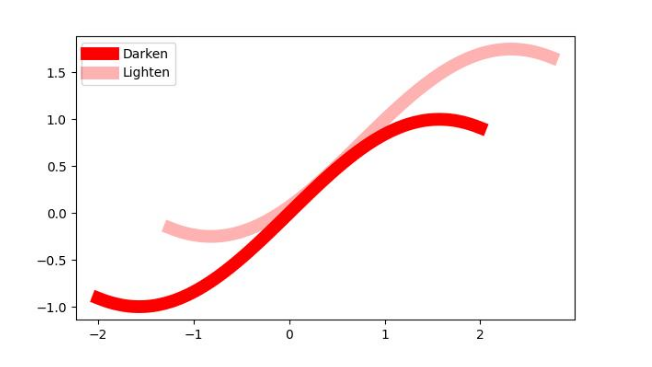
Use the alpha parameter in plot() to adjust transparency. Higher alpha = darker color.
ax.plot(xs, ys, c='red', lw=10, label="Darken")
ax.plot(xs+.75, ys+.75, c='red', lw=10, alpha=0.3, label="Lighten")
Vista Academy brings you a complete understanding of color customization in Matplotlib. Mastering these techniques ensures visually appealing and informative plots.