
A colorbar is a visual representation of the color scale used in a plot. It displays color variation from the minimum to maximum values, helping you interpret data visually.
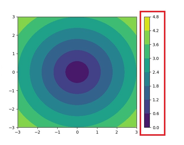
The matplotlib.colorbar module provides functionality for creating and customizing colorbars. Common functions used include Figure.colorbar() or pyplot.colorbar(), which work with ScalarMappable objects, often generated using imshow().
import numpy as np
import matplotlib as mpl
import matplotlib.pyplot as plt

fig, ax = plt.subplots(figsize=(6, 1), constrained_layout=True)
cmap = mpl.cm.cool
norm = mpl.colors.Normalize(vmin=5, vmax=10)
scalar_mappable = mpl.cm.ScalarMappable(norm=norm, cmap=cmap)
colorbar = fig.colorbar(scalar_mappable, cax=ax, orientation='horizontal', label='Some Units')
plt.title('Basic Colorbar')
plt.show()
import matplotlib.pyplot as plt
import numpy as np

data = np.random.random((10, 10))
fig, ax = plt.subplots(figsize=(7,4))
im = ax.imshow(data, cmap='viridis')
cbar = plt.colorbar(im, ax=ax)
plt.show()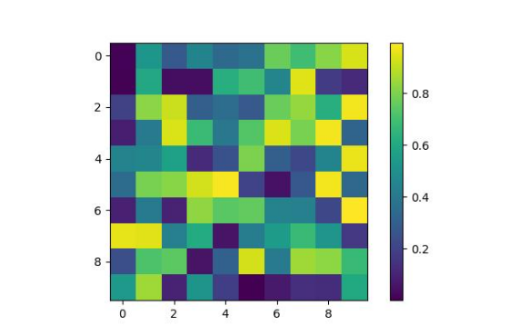
Each subplot can have its own colorbar automatically positioned for clarity.
import matplotlib.pyplot as plt
import numpy as np

fig, axs = plt.subplots(1, 2, figsize=(7,3))
cmaps = ['magma', 'coolwarm']

for col in range(2):
   ax = axs[col]
   pcm = ax.pcolormesh(np.random.random((20, 20)) * (col + 1), cmap=cmaps[col])
   fig.colorbar(pcm, ax=ax, pad=0.03)

plt.show()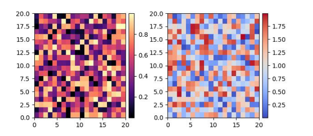
When you want precise control over layout, you can manually position the colorbar.
import numpy as np
import matplotlib as mpl
import matplotlib.pyplot as plt

npoints = 1000
x, y = np.random.normal(10, 2, (2, npoints))
fig, ax = plt.subplots(figsize=(7,4))
plt.title('Manual Colorbar Placement')
hexbin_artist = ax.hexbin(x, y, gridsize=20, cmap='gray_r', edgecolor='white')
cax = fig.add_axes([0.8, 0.15, 0.05, 0.3])
colorbar = fig.colorbar(hexbin_artist, cax=cax)
plt.show()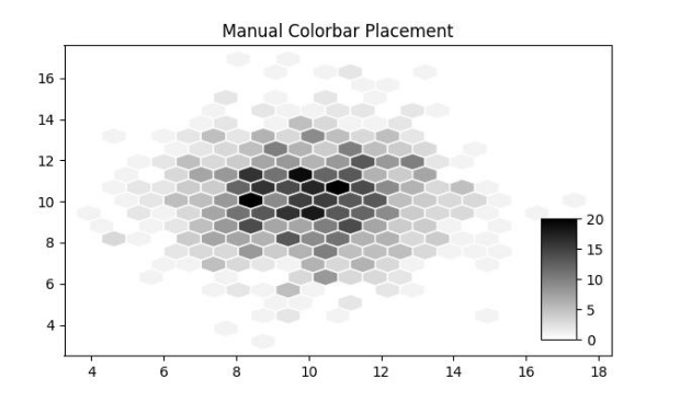
Colorbars can be customized using set_ticks, set_ticklabels, orientation, label formatting, and color styling.
import matplotlib.pyplot as plt
import numpy as np

fig, ax = plt.subplots(figsize=(7, 4))
data = np.random.normal(size=(250, 250))
data = np.clip(data, -1, 1)
cax = ax.imshow(data, cmap='afmhot')
ax.set_title('Horizontal Colorbar with Customizing Tick Labels')
cbar = fig.colorbar(cax, orientation='horizontal', label='A colorbar label')
cbar.set_ticks(ticks=[-1, 0, 1])
cbar.set_ticklabels(['Low', 'Medium', 'High'])
plt.show()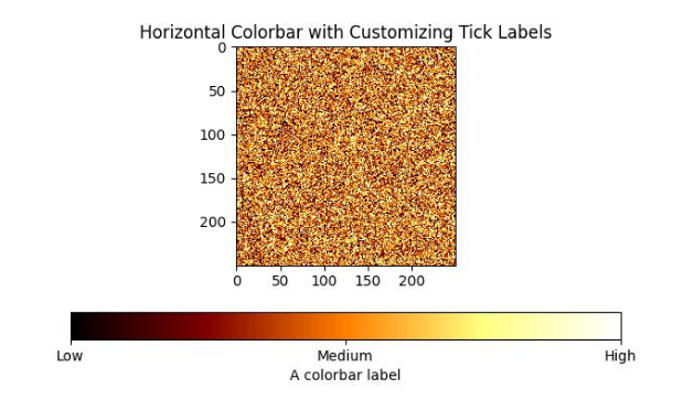
import numpy as np
from matplotlib import pyplot as plt

plt.rcParams["figure.figsize"] = [7.00, 3.50]
plt.rcParams["figure.autolayout"] = True

data = np.random.randn(4, 4)
im = plt.imshow(data, interpolation='nearest', cmap="PuBuGn")
clb = plt.colorbar(im, shrink=0.9, pad=0.05)
clb.ax.set_title('Color Bar Title')
clb.ax.set_yticks([0, 1.5, 3, 4.5], labels=["A", "B", "C", "D"])
clb.ax.tick_params(labelcolor='red', labelsize=20)
plt.show()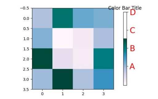
Presented by Vista Academy